Combobox
An input with suggestions. Without JavaScript it is the browser's own input list and datalist; with it, the ARIA APG editable combobox with a listbox popover, full keyboard support, and matching that finds places however people type them: without accents, by an older name, in another script, or spelled as heard.
quiet warm playful
Open the live demo
npx susegad add combobox
Stands on: Core, Core: components, Field (TextField, TextArea), Tokens
The prompt
the prompt
"Bombay", "मुंबई" and "mum" are all asking for Mumbai.
An input with suggestions. Without JavaScript it is the browser's own <input list> and <datalist>. With JavaScript it becomes the ARIA APG editable combobox, and its matching finds places however people type them.
<link rel="stylesheet" href="susegad/components/combobox/combobox.css">
<script type="module" src="susegad/components/combobox/combobox.js"></script>

<sg-combobox>
  <label for="from">Travelling from</label>
  <input id="from" name="from" list="cities" autocomplete="off">
  <datalist id="cities">
    <option value="Mumbai" data-aliases="Bombay, मुंबई">Maharashtra</option>
    <option value="Bengaluru" data-aliases="Bangalore, ಬೆಂಗಳೂರು">Karnataka</option>
  </datalist>
</sg-combobox>
The prompt
Build a combobox as a light-DOM custom element, <sg-combobox>, around a native <input list> with a visible <label> and a <datalist>, so that without JavaScript the browser's own suggestions work and the form submits whatever was typed. With JavaScript, follow the ARIA APG editable combobox with list autocomplete: remove the input's list, give it role="combobox", aria-autocomplete="list", aria-expanded and aria-controls, and build a listbox of the datalist's options as a manual popover anchored under the input with CSS anchor positioning. Keep focus in the input and move through the options with aria-activedescendant. Down Arrow opens the list and moves to the next option, Up Arrow to the previous, both wrapping; Enter chooses the active option and closes the list, or submits the form when none is active; Escape closes the list, and clears the text if it is already closed; Tab closes without choosing. Never choose for the person, and always keep what they typed. Match the way Indian place names are really typed: fold case and punctuation, strip accents from Latin letters only and leave the vowel signs of Devanagari, Kannada and other scripts alone, match the start of any word, and match aliases from data-aliases (older names and other scripts), saying "also Bombay" when an alias matched. Add a looser match for the usual romanisation variants (doubled vowels, aspirates, w for v), ranked below the exact ones. Mark the matched letters, mapping accents back to the original text. Say the number of suggestions in a polite status line once typing settles, only when it changes. Give it three registers. Quiet: a hairline box and list. Warm: write the input on the paper like the field and the select: no box, the field's pencil rule under it, inked from left to right while the input has focus and under the words away from it; a caret of two uneven pencil strokes; the list edged in ink and ruled in pencil between the suggestions, with the active suggestion's name underlined in ink by hand rather than filled. Playful: a stamped box with an off-register ghost, a caret in accent ink with a thick, round nib, and the suggestions as stamped chips. Keep the list's entrance off in quiet and under reduced motion.
Words to code
| When you say | Technique | What happens |
|---|---|---|
| without JavaScript the browser's own suggestions work | progressive enhancement | The <input list> and <datalist> are real HTML. The element reads the options from the datalist, so the no-JS path and the enhanced path share one list. |
| follow the ARIA APG editable combobox with list autocomplete | accessibility | The input is the combobox and keeps focus. The listbox is controlled by it, labelled by the same label, and the active option is announced through aria-activedescendant. |
| a manual popover anchored under the input with CSS anchor positioning | popover API, anchors | The list sits in the top layer, so no container clips it. anchor-name on the input and position-anchor on the list place it, with flip-block when there is no room below. Browsers without anchors get coordinates from JavaScript. |
| Never choose for the person, and always keep what they typed | the person decides | Typing opens the list with nothing selected. Only Enter on an active option or a click chooses. A place not in the list is kept and submitted as typed. |
| strip accents from Latin letters only | Unicode | Text is decomposed (NFD). A combining mark is dropped only when it follows a Latin letter, so "Balcão" folds to "balcao" while "मुंबई" keeps its anusvara and matras. |
match aliases from data-aliases | aliases | Each option can list other names. A match through an alias ranks just below the same kind of match on the name, and the option says which alias matched. |
| a looser match for the usual romanisation variants | folding | aa, ee and oo fold to a, i and u; th, dh, bh, kh, gh, ph and jh lose the h; w folds to v. "Tiruvanantapuram" finds Thiruvananthapuram, one rank below exact matches. |
| mapping accents back to the original text | highlighting | Each character is folded on its own and its position remembered, so the match in the folded text maps back and the <mark> wraps "Balcão", not "Balca". |
| Say the number of suggestions in a polite status line | live region | A visually hidden role="status" says "2 suggestions" 450 ms after typing stops, and nothing if the number has not changed. |
| the field's pencil rule under it, inked while the input has focus | shared drawing | ruleUnder() from field/rule.js: the field's graphite pencilRule() under the input, with the input's border turned transparent at the same width. On focus the ink runs the whole rule, drawn in over 560 ms; on blur it shrinks to the typed words, measured with canvas.measureText. |
| ruled in pencil between the suggestions … underlined in ink by hand | CSS masks | One hand-drawn stroke as an SVG data URI (--sg-pencil-line, vector-effect: non-scaling-stroke) is the mask for both: a ::before on each option but the last, in --sg-text-soft at 55%, and a ::after on the active option's .sg-combobox__value, in --sg-accent-text, so the underline is exactly as long as the name. The active option has no fill. |
| a caret of two uneven pencil strokes | SVG | caret() takes a list of [d, width]; warm passes two crossing strokes of 1.9 and 1.5. |
<sg-combobox> is a text input that suggests values as people type, for places, names and anything else with a known list and room for something new. It starts as the browser's own <input list> and <datalist>, and becomes the ARIA APG editable combobox when JavaScript runs.
Usage
<link rel="stylesheet" href="susegad/components/combobox/combobox.css">
<script type="module" src="susegad/components/combobox/combobox.js"></script>

<sg-combobox>
  <label for="from">Travelling from</label>
  <input id="from" name="from" list="cities" autocomplete="off" required>
  <datalist id="cities">
    <option value="Mumbai" data-aliases="Bombay, मुंबई">Maharashtra</option>
    <option value="Panaji" data-aliases="Panjim, पणजी">Goa</option>
  </datalist>
</sg-combobox>- The option's
valueis what goes into the input and the form. Its text (here the state) is shown beside it as a hint, and can be matched too. data-aliaseslists other names, comma-separated: an older name, a spelling people use, the name in another script.- Add
langto an option whose value is not English, so a screen reader pronounces it well. - The value is whatever the person types. The list only suggests. To insist on a listed value, validate it on the server, or with
setCustomValidity()and<sg-field-note>.
Attributes, properties and events
| Name | Kind | What it does |
|---|---|---|
register | attribute | quiet, warm or playful. Overrides the page's register for this element. |
open | property | Whether the suggestions are showing. |
suggestions | property | The values on show, best first. |
toggle() | method | Open or close the suggestions (the caret does this for a pointer). |
sg-choose | event | A suggestion was chosen. detail: { value }. The input also fires input and change, as typing would. |
sg-skin | event | Fires when a register's look has loaded. |
Matching
- Case, punctuation and extra spaces are ignored.
- Accents are ignored on Latin letters: "Balcao" finds "Balcão", "Sao Jacinto" finds "São Jacinto". Devanagari, Kannada and other scripts keep their vowel signs, because there they are letters.
- A match at the start of the name ranks first, then at the start of any word ("goa" finds "Old Goa"), then an alias ("Bombay", "मुंबई"), then a looser spelling match ("Tiruvanantapuram" finds Thiruvananthapuram), then three or more letters inside a word.
- Equally good matches keep the order of your datalist.
Keyboard
| Key | What it does |
|---|---|
| Typing | Filters the suggestions and opens the list. Nothing is chosen for you. |
| Down Arrow | Opens the list, or moves to the next suggestion (from the last, back to the first). Alt+Down opens without moving. |
| Up Arrow | Opens the list at the last suggestion, or moves to the previous one. |
| Enter | Chooses the highlighted suggestion. With none highlighted, submits the form as usual. |
| Escape | Closes the list. With the list closed, clears the text. |
| Tab | Closes the list and moves on, keeping what was typed. |
| Left, Right, Home, End | Back to editing the text. |
Registers
- Quiet: a hairline input with a plain chevron, and a raised list with a bar beside the highlighted suggestion. The list appears without motion. Without JavaScript, the input keeps this look and the suggestions are the browser's own.
- Warm: written on the paper like the field: no box, a pencil rule under the input (the field's own, from
field/rule.js) that inks from left to right while you type in it, and stays inked under the words when you leave. A caret of two uneven pencil strokes. The list is edged in ink and ruled in pencil between suggestions; the highlighted suggestion's name is underlined in ink by hand, not filled. The list unfurls in about a quarter of a second. - Playful: a stamped box with an off-register ghost and a thick, round accent caret; suggestions are stamped chips, slightly tilted, and the highlighted one is filled. A choice lands on the input with a small press.
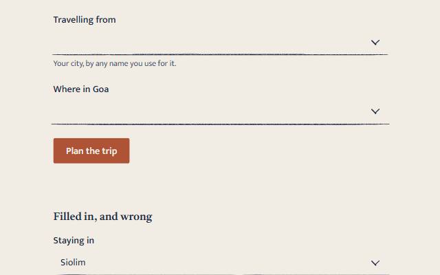
An input that is :user-invalid, or carries aria-invalid="true" for an error a server sends back, shows its edge (or its pencil rule, in warm) in the danger colour. Link the words with aria-describedby. The demo shows a filled-in value and a wrong one.
Accessibility
- Follows the ARIA APG editable combobox with list autocomplete. Focus stays in the input; the highlighted suggestion is announced through
aria-activedescendant, and the listbox is labelled by the input's label. - A polite status line says how many suggestions there are ("2 suggestions", "No suggestions") once typing settles, and only when the number changes.
- The chevron is
aria-hidden: the arrow keys do what it does. - The input is at least 44 pixels high, the suggestions at least 40.
- With reduced motion, the list's entrance and the chevron's turn are off.
combobox.check.mjschecks the no-JavaScript form, every key above, the screen-reader tree, matching across scripts, and every register under reduced motion. Zero axe violations in every register, light and dark.