Checkbox
A native checkbox that submits, validates and takes Space with or without JavaScript.
quiet warm playful
Open the live demo
npx susegad add check
Stands on: Core, Core: components, Engine, Stamp, Tokens
The prompt
the prompt
A box to tick, the oldest mark on a form.
A native checkbox that works with no JavaScript at all: it submits, it validates, Space ticks it, and a screen reader says what it is. The register changes how the box and the tick are drawn, never how the control behaves.
<link rel="stylesheet" href="susegad/components/check/check.css">
<script type="module" src="susegad/components/check/check.js"></script>

<sg-check>
  <label><input type="checkbox" name="rules" value="agreed" required> I have read the house rules</label>
</sg-check>

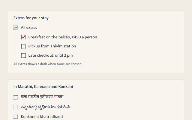
<sg-check controls="x-breakfast x-pickup">
  <label><input type="checkbox" id="x-all"> All extras</label>
</sg-check>| Attribute | Values | What it does |
|---|---|---|
indeterminate | present or absent | Shows "some" (a dash). HTML has no attribute for this, so the element sets the input's indeterminate property. A click clears it. |
controls | ids of child checkboxes | Makes this a "select all" box: checked when all are, mixed when some are, clear when none are. Ticking it ticks them all. |
seed | any word | The hand-drawn marks. Defaults to the label. |
The prompt
Make a checkbox web component that wraps a real <input type="checkbox"> inside its <label>, so the form works with JavaScript turned off. Style the native input with appearance: none as a hairline box with the tick drawn in CSS: a ::before clipped to a tick shape with clip-path, scaled in when checked, clipped to a bar when indeterminate, all in token colours with system-colour fallbacks. Put the box in the first column of a grid and align it with the first line of the label using the lh unit, so long labels and Devanagari or Kannada labels line up. Give it three registers. Quiet: exactly that CSS. Warm: lay an aria-hidden SVG over the box, in the same grid cell, with a box sketched in four separate pencil strokes that each run a little past their corners, so the corners cross and the box reads as drawn even at rest, and a heavy pencil tick half as thick again as the CSS one: resample each stroke and push it sideways with seeded noise so it wavers like a hand, and give the tick the small flick a pencil makes at the end. When someone ticks it, draw the tick in with a stroke-dashoffset animation over about a quarter of a second, starting slow the way a pen sets down; never animate on first paint. Playful: make the box a little rubber-stamp block, a heavy inked edge with a fine inner rule, and stamp a bold filled tick in ink, cut bigger than the box so it overprints the edge, with a seeded tilt, three spots of ink, and the Wave 1 stamp's ink texture starving it in places; press it down past flat (0.92) and back. Support a "select all" box through a controls attribute: it reflects its children as checked, mixed or clear, and ticking it ticks every child and fires real change events. In forced-colours mode, bring back the native checkbox and hide the drawing. Under reduced motion, marks appear with no movement.
Words to code
| When you say | Technique | What happens |
|---|---|---|
a real <input type="checkbox"> inside its <label> | native first | The input submits, validates (required), takes Space and names itself from the label. With JavaScript off the element is never defined and none of that changes. |
a ::before clipped to a tick shape | CSS shapes | One pseudo-element, clip-path: polygon(...) for the tick and inset(...) for the dash, scaled from 0 to 1 on :checked and :indeterminate. The colour is --sg-accent-text with a CanvasText fallback. |
align it with the first line using the lh unit | layout | margin-top: calc((1lh - 1.15em) / 2) centres the box on the first line whatever the script's line height. The browser check measures it within 3px for Marathi, Kannada and Konkani labels. |
| in the same grid cell | layering | The input and the SVG both take grid-area: 1 / 1; the SVG has pointer-events: none, so every click still lands on the real input. |
| wavers like a hand … the flick a pencil makes | noise | handLine resamples the stroke every 0.8 units and moves each point along its normal by seeded Perlin noise. The tick's last point runs 8% past the corner. |
| a box sketched in four strokes … the corners cross | sketch | sketchBox(seed) jitters the four corners, then draws each side from a seeded 0.35 to 1 times 1.8 units before its corner to as far past the next, each with handLine. Four M commands in one path. |
| a heavy pencil tick | stroke | stroke-width: 3.45 on the 20-unit grid, 1.5 times the old 2.3, so the mark reads at 1x. |
| over about a quarter of a second | Web Animations | arrival('ambient', 'draw') is 280 ms on cubic-bezier(0.55, 0.05, 0.3, 1), so the pen visibly starts and runs; the finished animation is cancelled. |
| a rubber-stamp block … overprints the edge | stamp | The playful box is pencilBox at a 2.1 stroke plus a 0.7 inner rule at 70%, hidden once the stamp prints. The tick is STAMP_TICK scaled 1.4 about a point just up and right of centre, so its long arm crosses the top edge. |
| the Wave 1 stamp's ink texture | alpha mask | inkMask() from stamp.core.js paints a 56 × 56 alpha mask (2 per unit) into a canvas, once per label, and an SVG <mask style="mask-type: alpha"> prints the tick through it. A tick this small can lose too much to one soft patch, so the skin takes the first of six seed variants that still prints 85% of the middle. |
| draw the tick in … never animate on first paint | a real change | The skin remembers the last state and animates stroke-dashoffset only on a change from clear to ticked. |
| a "select all" box | tri-state | triState(children) gives checked, mixed or clear. The parent sets aria-controls, and a screen reader hears "mixed". Ticking it sets each child and dispatches input and change, so the children's own drawings and any listeners follow. |
| bring back the native checkbox | forced colours | Under forced-colors: active the input gets appearance: auto and the drawing display: none, so high-contrast users get the system control in system colours. |
Accessibility
- The native checkbox is the control: its name comes from the label, its state from the browser, "mixed" included.
- Every drawing is
aria-hiddenand never takes a click. - The box edge, the pencil and the tick are 3:1 or more against every surface in every palette and theme (tested).
- A required box left clear is marked by the browser; after interaction the edge turns
--sg-dangertoo (:user-invalid), never colour alone, because the browser's message says what is wrong. - Forced colours: the system checkbox. Reduced motion: no movement.
<sg-check> wraps one native <input type="checkbox"> and its label. Everything a checkbox does, the input does, with or without JavaScript.
Use
<link rel="stylesheet" href="susegad/components/check/check.css">
<script type="module" src="susegad/components/check/check.js"></script>

<sg-check>
  <label><input type="checkbox" name="extras" value="breakfast" checked> Breakfast on the balcão</label>
</sg-check>
A label beside the input (<input id="doc-x"><label for="x">) also works.
Select all
<sg-check controls="x-breakfast x-pickup x-late">
  <label><input type="checkbox" id="x-all"> All extras</label>
</sg-check>
<sg-check><label><input type="checkbox" id="x-breakfast" name="extras" value="breakfast"> Breakfast</label></sg-check>
...
Give the "select all" input no name, so it is not sent with the form. Without JavaScript it is an ordinary checkbox that does nothing, so for a page that must work without scripts, leave it out or render it only when scripts run.
Attributes and properties
| Values | Default | |
|---|---|---|
indeterminate | boolean attribute | absent |
controls | space-separated ids of child checkboxes | none |
seed | any string, for the drawn marks | the label |
register | quiet, warm, playful | inherited |
checked (property) | boolean; setting it fires change | the input's |
Registers
| Look | Motion | |
|---|---|---|
| quiet (and no JS) | hairline box, crisp tick, a bar for "some" | the tick scales in under 200ms |
| warm | a box sketched in four pencil strokes whose corners cross, a heavy pencil tick, a pencil dash | the tick is drawn in over 280 ms when ticked |
| playful | a rubber-stamp block (a heavy inked edge and a fine inner rule); a bold stamped tick, cut bigger than the box and printed through the Wave 1 stamp's ink texture, with ink spots | the stamp presses down past flat and settles |
Reduced motion: marks appear with no movement. Forced colours: the system checkbox.
Accessibility
- Keyboard: Tab to it, Space to tick. Nothing added, nothing taken away.
- A screen reader hears the label and "checked", "not checked" or "mixed".
- Required: use
requiredon the input. The browser stops the form and says why. - Contrast: box edge, pencil and tick are 3:1 or more on every surface (WCAG 1.4.11), tested for every palette and theme.
Budget
Behaviour 8.6 KB of 12 KB (check.js + check.core.js); skins 0.3, 2.2 and 1.9 KB.