Select
The browser's own select, kept native: its keyboard, its screen-reader role and its place in the form are untouched.
quiet warm playful
Open the live demo
npx susegad add select
Stands on: Core, Core: components, Field (TextField, TextArea), Tokens
The prompt
the prompt
Keep the browser's own select, and draw it in your own hand.
A select that stays the native element. It keeps its keyboard, its screen-reader role and its place in the form, and still works with JavaScript off. Where the browser supports customizable select, CSS draws the button, the caret and the list of options.
<link rel="stylesheet" href="susegad/components/select/select.css">
<script type="module" src="susegad/components/select/select.js"></script>

<sg-select>
  <label for="room">Room</label>
  <select id="room" name="room" required>
    <option value="">Choose a room</option>
    <option value="balcao">Balcão, with the veranda</option>
  </select>
</sg-select>
The prompt
Build a select as a light-DOM custom element, <sg-select>, around a native <select> with a visible <label>, and never replace the native element: its keyboard, its role and its form value must stay the browser's own, and it must work with JavaScript off. Style it with CSS only: a hairline box with a 44-pixel target and a clear focus ring. Where appearance: base-select is supported, opt the select and its ::picker(select) into it, and draw the caret with ::picker-icon as a masked SVG chevron that turns when the select is :open, the list as a raised panel, and the chosen option with a ::checkmark. Give it three registers. Quiet: exactly that, with no motion but the caret turning. Warm: write the select on the paper like the field beside it: no box, the field's pencil rule drawn under it, a caret of two uneven pencil strokes that cross at the point rather than a chevron glyph, a list edged in ink, and ink laid over the rule as far as the chosen words go, drawn in from the left only when the person makes a choice. The rule must still meet 3:1. Playful: a stamped box, the edge in accent ink with an off-register ghost, a caret in accent ink with a thick, round nib, the options as stamped chips, slightly tilted, wrapping in the picker, and a small press on the control when a choice lands. Set a display on the picker only while it is open. With reduced motion, turn off every transition.
Words to code
| When you say | Technique | What happens |
|---|---|---|
| never replace the native element | native first | The element only follows the select's change, blur and invalid events and tells the skin. There is no rebuilt listbox to get wrong. |
opt the select and its ::picker(select) into it | customizable select | appearance: base-select on both unlocks styling of the button and the list while the browser keeps the listbox semantics and keyboard. Browsers without it show their own select, still hairline-bordered. |
draw the caret with ::picker-icon | CSS mask | The chevron is an SVG used as a mask over currentColor, so it takes the text colour in any theme. Warm swaps in a hand-drawn path. |
| the field's pencil rule drawn under it | shared drawing | ruleUnder() from field/rule.js draws the field's pencilRule() in graphite (GRAIN, an feTurbulence mask) under the select, running a few units past each end as ink overflow, so it never widens the page. The select's own border turns transparent and keeps its width, so nothing shifts. Measured at 1x: about 6:1 in light and 8:1 in dark, and 4.4:1 at the 10th percentile along its length. |
| two uneven pencil strokes that cross | CSS mask | The warm --sg-select-caret is two separate paths of different weights (1.9 and 1.5) that overlap at the point, masked over currentColor by ::picker-icon. |
| as far as the chosen words go, drawn in only when the person makes a choice | a real choice | The chosen text is measured with canvas.measureText in the select's font; rule.ink({ x, w }, true) lays an inkPath() over the rule and reveals it with a clip-path over 560 ms. A value the page arrived with is not a choice, so it is not inked. |
| a stamped box … an off-register ghost | CSS | A 1.5px accent-ink border with an uneven radius and box-shadow: 2px 2px 0 of the ink at 28%, as the Wave 1 stamp's ghost. |
| Set a display on the picker only while it is open | a pitfall | A display on ::picker(select) overrides the popover's hidden state, and every picker shows at once. The playful chips set display: flex only on select:open::picker(select). |
| With reduced motion, turn off every transition | reduced motion | The caret turn and the picker's entrance are off under prefers-reduced-motion; the choice itself is unchanged. |
<sg-select> wraps the browser's own <select> and leaves it native. People get the keyboard and screen-reader behaviour they already know, the form gets its value with or without JavaScript, and the page gets a select drawn in its register.
Usage
<link rel="stylesheet" href="susegad/components/select/select.css">
<script type="module" src="susegad/components/select/select.js"></script>

<sg-select>
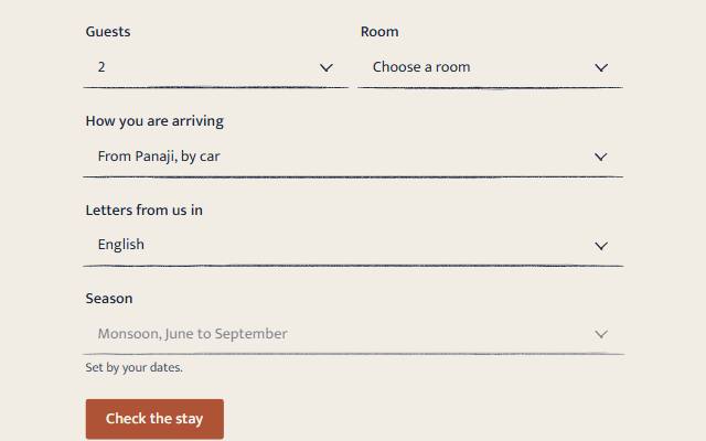
  <label for="guests">Guests</label>
  <select id="guests" name="guests">
    <option>1</option><option selected>2</option><option>3</option>
  </select>
</sg-select>
Everything a select can do still works: required, disabled, <optgroup>, lang on an option, aria-describedby for a hint. Put a <p> hint after the select and point aria-describedby at it.
Attributes and events
| Name | Kind | What it does |
|---|---|---|
register | attribute | quiet, warm or playful. Overrides the page's register for this element. |
change, input | events on the <select> | The browser's own. The element adds none of its own for a choice. |
sg-skin | event | Fires when a register's look has loaded. |
Registers
- Quiet: a hairline box with a plain chevron. The list is a raised panel with a checkmark on the chosen option. Only the chevron moves, turning as the list opens. Without JavaScript, this is what shows.
- Warm: written on the paper like the field: no box, a pencil rule drawn by hand under the select (the field's own, from
field/rule.js), a caret of two uneven pencil strokes, a list edged in ink, and the chosen option underlined in the accent colour. When the person makes a choice, ink runs over the rule as far as the chosen words go, drawn in over about half a second. A value the page arrived with is not inked. The rule measures about 6:1 against the page in light and 8:1 in dark. - Playful: a stamped box, its edge in accent ink with an off-register ghost, and a thick, round accent caret. The options are stamped chips, slightly tilted, wrapping in the picker, and the chosen one is filled. A choice lands on the control with a small press.
Browsers without customizable select (appearance: base-select) show their own select with the hairline border in every register.
Accessibility
- The
<select>is the control: a combobox named by its<label>, with its own listbox, keyboard (Space or Enter opens it, arrows move, Enter chooses, Escape closes, typing jumps) and form value. - The drawn parts are CSS or
aria-hiddenSVG. Nothing is added to the accessibility tree. - The target is at least 44 pixels high, and the focus ring is the token focus colour.
:user-invalidturns the border (the pencil rule in warm) to the danger colour after the person has tried, and so doesaria-invalid="true", for an error a server sends back. Pair it with<sg-field-note>, or a message linked byaria-describedby, for the words. The demo shows a chosen value and a wrong one.- With reduced motion, every transition is off.
select.check.mjschecks the no-JavaScript form, the keyboard, the screen-reader tree and every register under reduced motion. Zero axe violations in every register, light and dark.