Postcard
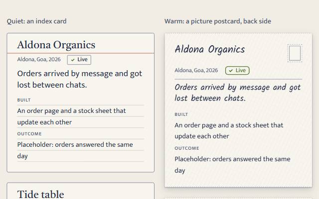
A card for a piece of work: title, where and when with a status badge beside them, the problem in a line, what was built and the outcome. The heading's link is stretched over the card, so each card is one tab stop with nothing nested. A rubber stamp for the status is opt-in (status-style="stamp").
quiet warm playful
Open the live demo
npx susegad add postcard
Stands on: Badge, Core, Core: components, Engine, Tokens
The prompt
the prompt
A card for a piece of work in a portfolio, a room on a homestay's site, a product in a small shop's catalogue.
A title, where and when with a status beside it, the problem in a line, what was built, the outcome, and one link that makes the whole card a target.
<link rel="stylesheet" href="susegad/components/postcard/postcard.css">
<link rel="stylesheet" href="susegad/components/badge/badge.css">
<script type="module" src="susegad/components/postcard/postcard.js"></script>
<script type="module" src="susegad/components/badge/badge.js"></script>

<sg-postcard>
  <article>
    <h3><a href="/work/aldona">Aldona Organics</a></h3>
    <p class="sg-postcard-where">Aldona, Goa, 2026 <sg-badge tone="success">Live</sg-badge></p>
    <div class="sg-postcard-face"><p class="sg-postcard-problem">Orders arrived by message and got lost between chats.</p></div>
    <dl class="sg-postcard-back">
      <dt>Built</dt><dd>An order page and a stock sheet that update each other</dd>
      <dt>Outcome</dt><dd>Orders answered the same day</dd>
    </dl>
  </article>
</sg-postcard>
For the one card that should shout, opt in to a rubber stamp (add the stamp component's CSS and script):
<sg-postcard status-style="stamp" postmark="Aldona 2026">
  <article> …
    <sg-stamp role="none" tone="success"><p class="sg-stamp-words"><strong>Live</strong></p></sg-stamp>
  </article>
</sg-postcard>
The prompt
Make a portfolio card web component around an <article>: a heading with the card's only link, a where-line (the place and year) with a small, level status badge beside it, a one-line problem, and a short definition list of what was built and the outcome. Stretch the heading link over the whole card with a positioned ::after, so the card is one tab stop, clicking anywhere follows it, and nothing interactive is nested; draw the focus ring round the whole card. Without JavaScript it must be a complete index card. Keep stamps rare: the status is a badge by default, and only a card with status-style="stamp" carries a rubber stamp in its corner instead. Give it three registers. Quiet: an index card, a red hairline under the heading and faint ruled lines under the details. Warm: the back of a picture postcard, on card stock with faint fibres and a deckled top and bottom edge, the message on the left taking about two thirds, a divider, ruled address lines on the right (on a card narrower than 44rem the address lines move up beside the title and the message runs the full width), and in the corner a printed postage square with no word on it, as ornament only. When the card opts in to a stamp, the stamp takes that corner and a postmark sits on its lower corner, its ring lettered with a place and year and its wavy lines running under the stamp, never across its word. Playful: set the card down a little crooked with a hard shadow; the problem is the picture side, in the hand on a bright tile, and on hover or when the link has focus it turns over (a 3D turn with transform only) to show the details. Only turn where the pointer can hover and motion is full; on a touch screen, under reduced motion and without JavaScript, both sides lie flat one above the other.
Words to code
| When you say | Technique | What happens |
|---|---|---|
| stretch the heading link over the whole card | block link | h3 a::after { position: absolute; inset: 0; z-index: 2 } against the positioned article; article:has(a:focus-visible) draws the ring. The check samples three points on each card and finds the same link, and counts one focusable per card. |
| a small, level status badge … by default | reuse, statusStyle() | The where-line is a flex row; the badge is <sg-badge>, never rotated. statusStyle(attr) reads anything but "stamp" as "badge"; the element warns about a stamp on a card that didn't ask for one. |
| card stock … a deckled edge | CSS | Two faint repeating gradients over the raised surface; a mask of small radial bites along the top and bottom. A drop-shadow filter on the host replaces the box-shadow the mask would cut. |
| the message side takes about two thirds … the full width on a narrow card | container queries | From 44rem the columns are 1fr 1px 30%. Below 44rem the grid is "title status" "where address" "face face" "back back": the address lines sit under the postage square and the message runs full width. A 560 px card with four lines of problem and 40-word details was 4 to 5 words a line before; now 8 to 10. |
| a printed postage square with no word | ornament | The warm skin adds an empty, aria-hidden .sg-postcard-postage; CSS hides it when the card has a stamp. |
| a postmark sits on its lower corner | measured placement | Only with a stamp: the warm skin reads the stamp's offsetLeft, offsetTop and offsetHeight and puts the ring's centre on its lower-left corner; postmark(seed) draws the rings and four wavy lines below the ring's centre. |
| set the card down a little crooked | seeded tilt | tilt(seed): 0.8 to 2.2 degrees either way, never flat. |
| turns over … transform only | CSS 3D | Face and back share one grid cell with backface-visibility: hidden; :is(:hover, :focus-within) swaps their rotateY, only under [data-flip]. |
| only where the pointer can hover and motion is full | gating | canFlip({ motion, hover }); the skin sets data-flip from ctx.motion and matchMedia('(hover: hover) and (pointer: fine)'). |
Accessibility
- One link per card, in the heading; the heading text is the link's name. The element warns about a second link.
- The status is words in a badge (or a stamp with
role="none"), read with the card in order. - The details are in the DOM in reading order in every register, whether or not the card has turned.
- The postage square and the postmark are
aria-hiddenand carry no words. - Forced colours: the card drops its deckle and keeps a CanvasText border.
<sg-postcard> is a card for a piece of work: title, where and when with a status, the problem in a line, what was built, the outcome and a link. It enhances an <article>.
Markup
| Element | What it is |
|---|---|
<article> | required |
<h2>–<h4> with one <a href> | the title and the card's only link; it covers the whole card |
p.sg-postcard-where | the place and year, with the status as <sg-badge> beside them: success (Live), accent (Shipped), info (Experiment) |
.sg-postcard-face with .sg-postcard-problem | the problem in a line (the picture side in playful) |
dl.sg-postcard-back | the details: Built, Outcome, anything else as dt/dd pairs |
Keep other links out of the card; put them under it.
Status: a badge, or a stamp when asked for
By default the status is a level badge on the where-line. A rubber stamp on every card reads as heavy, so it is opt-in: set status-style="stamp" and put an <sg-stamp role="none"> in the article (as its last child) instead of the badge. It sits in the card's top corner; in warm it gets a postmark, lettered from the postmark attribute. The element warns if a card has a stamp without asking for one.
Attributes
| Attribute | Values | Default |
|---|---|---|
status-style | badge, stamp | badge |
postmark | a place and year for the warm postmark, e.g. "Aldona 2026" (stamp style only) | no lettering |
seed | the tilt and postmark's hand | the title |
register | quiet, warm, playful | inherited |
Registers
| Look | Motion | |
|---|---|---|
| quiet | an index card: a red hairline under the title, ruled lines under the details | none |
| warm | a postcard's back on card stock with a deckled edge: divider, address lines, a printed postage square with no word (the stamp and a postmark instead, in stamp style) | none |
| playful | tilted, hard shadow, the problem on a bright tile | turns over on hover or focus, where it may (below) |
The playful card turns over only with a hovering pointer and full motion. On touch screens, under reduced motion and without JavaScript, both sides show one above the other. The warm card's message side takes about two thirds from 44rem up. Below 44rem the address lines move up under the postage square (or stamp), beside the title and where-line, and the message runs the full width under a pencil rule, so real-length copy keeps six or more words a line (checked with fictional copy of a real card's length at 560 px). Below 30rem the address lines go.
In a grid
Cards stretch to their grid cell's height (height: 100%), so a row of cards lines up. Leave about 10 px around playful cards for the tilt and shadow; the element pads itself by that much.
Accessibility
- One tab stop per card; the whole card is the link's target; the focus ring goes round the card.
- The details are always in the DOM, in reading order.
- Contrast on the playful tile (on-accent on accent) and back (text on the highlighter) is tested in every palette and theme.