Badge
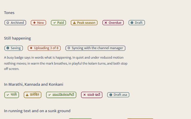
A word or two of status. The text is the meaning, a distinct shape per tone backs it up, colour comes last. Quiet is text with a hairline rule; warm is a hand-inked outline in the tone's ink; playful is a chip of colour with a kolam flower on the corner.
quiet warm playful
Open the live demo
npx susegad add badge
Stands on: Core, Core: components, Engine, Tokens
The prompt
the prompt
A word or two of status beside the thing it describes: Paid, Draft, Overdue, Saving.
The word is the meaning. A small shape for each tone backs it up for anyone who cannot tell the colours apart, and colour comes last.
<link rel="stylesheet" href="susegad/components/badge/badge.css">
<script type="module" src="susegad/components/badge/badge.js"></script>

<sg-badge tone="success">Paid</sg-badge>
<sg-badge tone="warning">Deposit due</sg-badge>
<sg-badge tone="info" busy>Saving</sg-badge>| Attribute | Values | What it does |
|---|---|---|
tone | neutral, accent, success, warning, danger, info | The ink and the shape: a ring, a diamond, a tick, a triangle, a cross, a circled i. |
busy | present or absent | The thing is still happening. The words must say so ("Saving", "Checking payment"); the mark moves only in warm and playful. |
seed | any word or number | The hand-inked outline in warm. Defaults to the text. |
The prompt
Make a status badge web component that is just text: <sg-badge tone="success">Paid</sg-badge>. Never let colour carry the meaning alone. Put a small shape before the words, a different outline for each tone (a ring for neutral, a diamond for accent, a tick for success, a triangle with a bar for warning, a cross for danger, a circled i for info), drawn as a CSS mask on an empty pseudo-element so a screen reader reads only the words. Without JavaScript, show the words in the text colour, the shape in the tone's colour, and a hairline rule around them. Give it three registers. Quiet: exactly that, and nothing moves. Warm: replace the rule with a hand-inked outline in the tone's ink, drawn twice like a nib going round, nudged by seeded noise and closed with a small overlap where the pen passes its start; fit it to the badge's size and redraw when the words change. Playful: fill the badge with the tone as a rounded chip, set the words in the page colour on it, and stick a tiny kolam flower on the top-right corner like a sticker, so it reads as ornament and never as a button. When a badge is busy, breathe the shape slowly in warm and turn the kolam in playful, pause both off screen, and keep everything still under reduced motion. Check that the chip's text meets 4.5:1 on its fill in every palette and theme.
Words to code
| When you say | Technique | What happens |
|---|---|---|
| never let colour carry the meaning alone | redundancy | The word always carries the meaning. ICONS holds six outlines on a 12 × 12 grid, all different, and a test checks they stay different and that badge.css carries exactly those shapes. |
| a CSS mask on an empty pseudo-element | native first | ::before { content: ""; mask: var(--sg-badge-icon) }. With no content text there is nothing for assistive tech to read twice, and it works with no JavaScript. |
| drawn twice like a nib going round … closed with a small overlap | noise | inkOutline(w, h, seed) resamples a rounded rectangle every 4 px and pushes each point out from the centre by seeded Perlin noise, scaled by the register's --sg-wobble. The second pass is finer, offset and fainter. The path runs a few points past its start. |
| fit it to the badge's size | layout | A ResizeObserver redraws the path at the badge's fractional size, with preserveAspectRatio="none". A viewBox a fraction off scaled the whole outline in towards the words. |
| like a sticker … never as a button | affordance | A trailing icon on a chip reads as "remove" or "add". The kolam flower sits on the corner, overlapping the edge, where controls never go. |
| breathe … turn … pause both off screen | calm | busyMotion(motion) returns nothing for quiet and reduced motion, an opacity breath for warm, and a slow turn for playful. The skin plays and pauses the Web Animation as the badge enters and leaves the screen. |
| 4.5:1 on its fill in every palette and theme | contrast | The chip's text is the raised surface on the tone (or on-accent on accent). Every tone is already 4.5:1 against the surfaces, so the pair holds, and the tests check it for every palette and theme. |
Accessibility
- The badge is inline text. Nothing about it is focusable or interactive; if a status needs an action, put a button beside it.
- The shape and the kolam are
aria-hiddenor content-free. The words are the only thing read. - Busy badges must say what is happening in words. Motion is decoration: none in quiet, none under reduced motion, paused off screen.
- Every tone's text is 4.5:1 or more on every surface in warm, and on the tone's own fill in playful (tested for Susegad and Casa, light and dark).
Credit
The kolam flower is a small four-petal pulli kolam, the dot-grid form drawn at thresholds across South India. Tier: shared practice with local forms, used here as a small ornament only.
<sg-badge> is a word or two of status: Paid, Draft, Overdue, Saving. The text is the meaning; a shape per tone backs it up; colour comes last.
Use
<link rel="stylesheet" href="susegad/components/badge/badge.css">
<script type="module" src="susegad/components/badge/badge.js"></script>

<p>Your booking is <sg-badge tone="success">Confirmed</sg-badge>.</p>
<sg-badge tone="info" busy>Saving</sg-badge>
A server can swap the words (htmx hx-swap="innerHTML") or the tone; the badge re-fits its outline and re-detects the script.
Attributes
| Attribute | Values | Default |
|---|---|---|
tone | neutral, accent, success, warning, danger, info | neutral |
busy | boolean: the thing is still happening | absent |
seed | any string, for the warm outline | the text |
register | quiet, warm, playful | inherited |
| Tone | Shape | Use it for |
|---|---|---|
| neutral | ring | archived, counts, facts |
| accent | diamond | new, featured, direct |
| success | tick | paid, confirmed, done |
| warning | triangle with a bar | due soon, peak season, needs a look |
| danger | cross | failed, overdue, declined |
| info | circled i | draft, returning guest, checking |
Registers
| Look | When busy | |
|---|---|---|
| quiet | text colour, the tone's shape, a hairline rule | nothing moves; the words say it |
| warm | the tone's ink, a hand-inked outline drawn twice | the shape breathes slowly |
| playful | a chip of the tone, words in the page colour, a kolam flower on the corner | the flower turns |
Reduced motion keeps every register still. Busy motion pauses when the badge is off screen.
Accessibility
- Inline text, never focusable. If a status needs an action, put a button next to it.
- Do not rely on the tone: "Failed" in a red badge still says "Failed".
- Busy badges must say in words what is happening ("Checking payment", not only a turning flower).
- Contrast: warm text is 4.5:1 or more on every surface; the playful chip's text is 4.5:1 or more on its own fill, in every palette and theme (tested).
- Devanagari and Kannada badges get more line height, so matras are not clipped.
Budget
| File | Bytes |
|---|---|
badge.js + badge.core.js (behaviour) | 7.4 KB of 12 KB |
skins/quiet.js | 0.2 KB |
skins/warm.js | 2.1 KB |
skins/playful.js | 1.3 KB |
Nothing runs per frame except a busy badge's single Web Animation in warm or playful.