Toggle
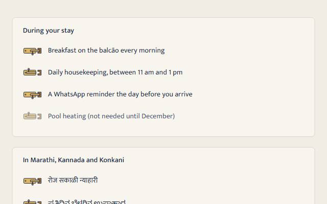
A native switch (a checkbox with role="switch") that submits and takes Space with or without JavaScript. Quiet is a plain track and thumb drawn by CSS; warm is the brass tower bolt from a Goan door, sliding into its keeper; playful is a clay diya that lights, its flame flickering only while lit and on screen.
quiet warm playful
Open the live demo
npx susegad add toggle
Stands on: Core, Core: components, Engine, Tokens
The prompt
the prompt
On or off, now: a latch on a door, a lamp in a niche.
A native switch: a checkbox with role="switch", so a screen reader says "switch, on" or "off", and it submits with the form like any checkbox, with or without JavaScript. Warm draws the brass tower bolt from a Goan door; playful lights a clay diya.
<link rel="stylesheet" href="susegad/components/toggle/toggle.css">
<script type="module" src="susegad/components/toggle/toggle.js"></script>

<sg-toggle>
  <label><input type="checkbox" role="switch" name="breakfast" value="yes" checked> Breakfast every morning</label>
</sg-toggle>| Attribute | Values | What it does |
|---|---|---|
seed | any word | The lamp's flicker, so two lamps never flicker in step. Defaults to the label. |
The prompt
Make a toggle web component around a real <input type="checkbox" role="switch"> inside its label, so it works without JavaScript and a screen reader calls it a switch. Draw the quiet switch with CSS on the native input: appearance: none, a pill track, and a ::before thumb that slides across when checked, the track filling with the accent and the thumb turning to the on-accent colour. Give it three registers. Quiet: exactly that. Warm: a brass tower bolt from a Goan door, as an aria-hidden SVG over the input: a plate with two screws, a keeper on the right, and a bolt with a handle; off, the bolt is drawn back with the handle up; on, it slides into the keeper and the handle turns down. Drive the slide with a CSS transition on the register's duration and spring, keyed off a data-on attribute, so reduced motion makes it instant with no extra code. Playful: a clay diya; off, a dark wick; on, a flame and a soft glow; while it is lit and on screen, the flame flickers from seeded noise, looping without a jump, and it pauses off screen and holds still under reduced motion. Outline every shape that shows the state in the text colour, so the state is 3:1 against the page even though brass and flame are pale. Size the native input to the drawing so every click lands on it. In forced colours, bring back the native control.
Words to code
| When you say | Technique | What happens |
|---|---|---|
role="switch" | native first | The browser exposes a switch with on and off. Written in the HTML it works without JavaScript; the element adds it if a builder forgot. |
a ::before thumb that slides across | CSS | The thumb is translated by the track's width minus its own; the transition uses --sg-dur-quick, which the tokens take to 0.01ms under reduced motion. |
slides into the keeper … keyed off data-on | CSS transition | The skin only toggles data-on on the SVG. The bolt group moves 8.5 units, exactly far enough to seat inside the keeper's inner wall (the tests check it), with --sg-dur-calm and --sg-ease-spring. |
| the handle turns down | state by shape | Off and on are different drawings, not colours: the handle up with a gap before the keeper, or down with the bolt inside it. |
| flickers from seeded noise, looping without a jump | noise | flicker(t, seed) gives scale and lean from Perlin noise; flameAnimation samples twelve frames and ends on the first, as a looping Web Animation. |
| pauses off screen | calm | The component base reports visibility; the skin pauses and plays the flame. The browser check scrolls a lit lamp away and sees it paused. |
| outline every shape that shows the state | contrast | Bolt, keeper, bowl and flame are stroked in --sg-text, so the state reads at 3:1 or more against any surface while brass and flame stay decorative. |
| size the native input to the drawing | hit area | The input takes the drawing's size and sits under it in the same grid cell; the drawing has pointer-events: none. |
Accessibility
- A screen reader hears "switch", the label, and "on" or "off". Space toggles it.
- Use a switch for something that takes effect now or a setting; use a checkbox for a choice sent later. Both submit.
- Track, thumb and outlines are 3:1 or more in every palette and theme (tested).
- The flame moves only while lit, on screen, in playful motion. Forced colours: the system control.
Credit
The tower bolt is the iron and brass latch on the teak doors of Goan houses. The diya is the clay oil lamp lit across India. Tier: pan-Indian (the diya) and local (the Goan bolt), both everyday objects.
<sg-toggle> wraps one native <input type="checkbox" role="switch"> and its label. It submits and takes Space with or without JavaScript, and a screen reader calls it a switch.
Use
<link rel="stylesheet" href="susegad/components/toggle/toggle.css">
<script type="module" src="susegad/components/toggle/toggle.js"></script>

<sg-toggle>
  <label><input type="checkbox" role="switch" name="reminder" value="whatsapp" checked> A WhatsApp reminder the day before</label>
</sg-toggle>
When off, a switch sends nothing (like any checkbox). Read it on the server as "present means on".
Attributes and properties
| Values | Default | |
|---|---|---|
seed | any string, for the lamp's flicker | the label |
register | quiet, warm, playful | inherited |
checked (property) | boolean; setting it fires input and change | the input's |
Registers
| Look | Motion | |
|---|---|---|
| quiet (and no JS) | a plain track and thumb; on fills the track with the accent | the thumb slides under 200ms |
| warm | a brass tower bolt; on, the bolt is in the keeper and the handle is down | the bolt slides on the register's spring |
| playful | a clay diya; on, a flame and a glow | the flame flickers while lit and on screen |
Reduced motion: no movement anywhere, the bolt already home, the flame still. Forced colours: the system control.
Accessibility
- Keyboard: Tab to it, Space to switch.
- The state is always a shape (thumb side, bolt position, flame) outlined in the text colour, never colour alone.
- Contrast: track edge, filled track, thumb and outlines are 3:1 or more (WCAG 1.4.11), tested for every palette and theme.
Budget
Behaviour 5.3 KB of 12 KB (toggle.js + toggle.core.js); skins 0.3, 2.2 and 1.6 KB.