Radio group
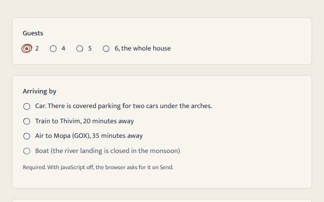
A real fieldset of native radios: arrow keys, one choice per name, required and submitting all stay the browser's, with or without JavaScript.
quiet warm playful
Open the live demo
npx susegad add radio
Stands on: Core, Core: components, Engine, Tokens
The prompt
the prompt
One choice from a few, the way a paper form circles an answer.
A real <fieldset> of native radios. The browser keeps doing what it always has: the arrow keys move and choose, one name allows one choice, required stops the form, the chosen value is sent. The register only changes how the circles are drawn.
<link rel="stylesheet" href="susegad/components/radio/radio.css">
<script type="module" src="susegad/components/radio/radio.js"></script>

<sg-radio-group orientation="row">
  <fieldset>
    <legend>Guests</legend>
    <label><input type="radio" name="guests" value="2" checked> 2</label>
    <label><input type="radio" name="guests" value="4"> 4</label>
  </fieldset>
</sg-radio-group>| Attribute | Values | What it does |
|---|---|---|
orientation | column (default), row | Lays the choices out down or across. |
seed | any word | The hand-drawn rings. Defaults to the legend. |
The prompt
Make a radio group web component that wraps a real <fieldset> with a <legend> and native radios in labels, so it works with JavaScript off and keeps the browser's arrow keys, grouping, required and submission. Style each radio with appearance: none as a hairline circle with a CSS dot that scales in when chosen, aligned to the first line of its label with the lh unit. Give it three registers. Quiet: exactly that. Warm: over each radio, in the same grid cell and aria-hidden, draw a pencil circle whose ends cross, and for the chosen one an ink dot and an inked ring drawn round it the way a pen circles an answer on a paper form: a leaning oval a quarter bigger than a plain ring, well past the radio's edge, whose radius wavers with seeded noise, started at a seeded angle and carried past its start, spreading outward as it goes so the overlap shows at 1x. When the choice moves, draw the new ring in. Playful: a bold inked circle for each, and for the chosen one a kolam flower in place of the circle: four round petal loops drawn round the pulli, filling the circle with a notch between each pair, the pulli left as a hole of paper, blooming with a small turn. Show disabled radios dashed in every register. In forced-colours mode bring back the native radios; under reduced motion, no movement.
Words to code
| When you say | Technique | What happens |
|---|---|---|
a real <fieldset> with a <legend> | native first | The group is announced by its legend ("group, Guests"). The browser's arrow keys, Tab stop on the chosen radio, skipping disabled ones and required all work with no script. |
| the way a pen circles an answer | noise | handRing(seed, opts) walks 1 + overlap turns of a circle, adding seeded Perlin noise to the radius and starting at a seeded angle. spread ramps the radius outward over the last third of a turn, so the overrun runs outside the start instead of on top of it. |
| a leaning oval a quarter bigger | geometry | The chosen ring is r: 10.4 (the old ring was 8.6), squash: 0.8 and tilt: -14, carried 0.3 turns past its start with a spread of 1.5. It spills past the 20-unit box; the SVG has overflow: visible. The browser check measures it at 1.23 times the radio's width. |
| draw the new ring in | a real change | The group counts real change events; the ring's stroke-dashoffset animates only when a new radio has just been chosen, never on first paint. |
| a kolam flower in place of the circle | motif | Four cubic petals from the centre out to 8.4 units and back, round at the tip, filled in ink at 88%; the notches between them give the flower its outline at 20 px. The pulli is a 1.7-unit circle in the surface colour, and the plain ring is hidden while the flower shows. |
| dashed in every register | state | input:disabled ~ .sg-radio-art dashes the pencil and the ink circle; the native disabled state keeps it out of the arrow keys. |
| bring back the native radios | forced colours | appearance: auto and the drawing hidden under forced-colors: active. |
Accessibility
- Keyboard: Tab lands on the chosen radio (or the first, if none); the arrow keys move and choose and skip disabled radios; Tab leaves the group. All native.
- A screen reader hears the legend, then each radio's label and state.
- Circles, rings and dots are 3:1 or more on every surface in every palette and theme (tested).
- The drawing is
aria-hiddenand never takes a click. Forced colours: the system radios. Reduced motion: no movement.
Credit
The kolam dot is a pulli with petal loops, from the dot-grid kolam drawn at thresholds across South India. Tier: shared practice with local forms, used here as a small ornament.
<sg-radio-group> wraps a <fieldset> of native radios. The fieldset, the legend and the radios do all the work, with or without JavaScript.
Use
<link rel="stylesheet" href="susegad/components/radio/radio.css">
<script type="module" src="susegad/components/radio/radio.js"></script>

<sg-radio-group>
  <fieldset>
    <legend>Arriving by</legend>
    <label><input type="radio" name="arrive" value="car" required> Car</label>
    <label><input type="radio" name="arrive" value="train" required> Train to Thivim</label>
    <label><input type="radio" name="arrive" value="boat" disabled> Boat (closed in the monsoon)</label>
  </fieldset>
</sg-radio-group>
Always give the group a <legend>: it is the question the radios answer, and what a screen reader says first.
Attributes and properties
| Values | Default | |
|---|---|---|
orientation | column, row | column |
seed | any string | the legend |
register | quiet, warm, playful | inherited |
value (property) | the chosen radio's value, or ''; setting it chooses and fires change | |
radios (property) | the native radios, in order |
A server can swap the options (htmx); the drawings follow.
Registers
| Look | Motion | |
|---|---|---|
| quiet (and no JS) | hairline circles, a crisp dot | the dot scales in under 200ms |
| warm | pencil circles whose ends cross; the choice gets an ink dot and is circled in ink, a leaning oval a quarter bigger that runs past its start, as a pen circles an answer | the ring is drawn in when the choice moves |
| playful | bold inked circles; the choice becomes a four-petalled kolam flower in place of its circle | the kolam blooms with a small turn |
Reduced motion: no movement. Forced colours: the system radios.
Accessibility
- Keyboard: native. Tab to the chosen radio, arrows to move and choose, disabled radios skipped.
- Required: put
requiredon the radios; the browser stops the form and says why. - Contrast: circles, rings and dots are 3:1 or more on every surface (WCAG 1.4.11), tested for every palette and theme.
Budget
Behaviour 5.8 KB of 12 KB (radio.js + radio.core.js); skins 0.3, 2.5 and 1.4 KB.